Spotify
UI redesign of the most popular service of music streaming
Client
Spotify
Client's description
Spotify is a digital music, podcast, and video service that gives you access to millions of songs and other personalized content based on your personal activity inside the platform.
Timeline
Nov 15th - 23rd, 2023 (2 weeks)
Tools
- Figma
- Notion
- Canva
Overview
I did an audit, and then redesign of the look & feel of the app that is, by far, the one that I use the most (around 360 hours monthly!).
My main objective was designing a new feature focusing on the business proposal of the highly-personalized contents and redesigning two main pages of the user's flow, to make it more intuitive to the user to find what is a personal keen.

How might we redesign Spotify's user interface to improve content accessibility, particularly for frequently accessed items like "Liked Songs," while enhancing content organization and personalization to create a more intuitive and efficient user experience?
As a UX designer and UI developer, provide a redesign that would make it easier to users to access their favorite songs.
Empathize
Design Audit
After doing a Design Audit, I identified 3 main issues with the usability of the app.
1 - Current Spotify design makes the User Flow to access "Liked Songs" a bit too complicated:
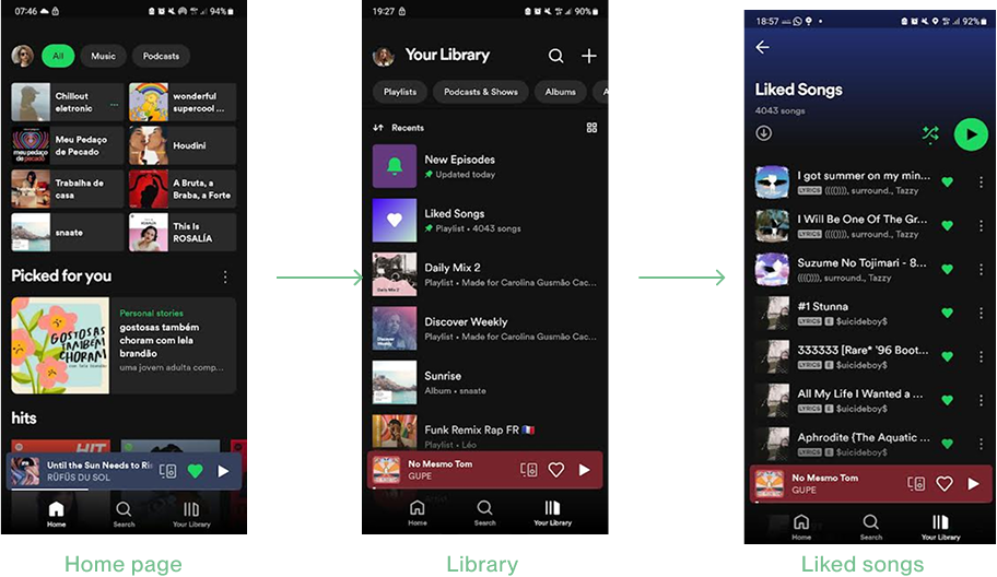
Problem: by default, the app sorts playlists by recent listening activity on "Library" page, which can push the "Liked Songs" playlist to the bottom of the library, requiring from the user some effort to find this app section.
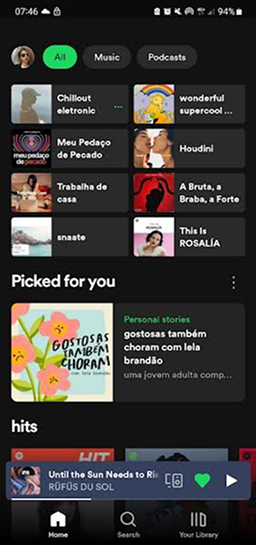
2 - Home page
Problems:
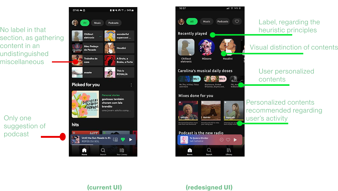
- Lack of visual distinction between content types (music, albums, artists, playlists);
- Missing section title for the content at the top of the page;
- Difficult access of the "Liked Songs"; the personalized recommendations are not intuitively positioned on the page.
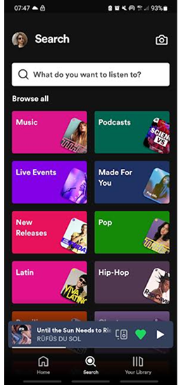
3 - "Search" page
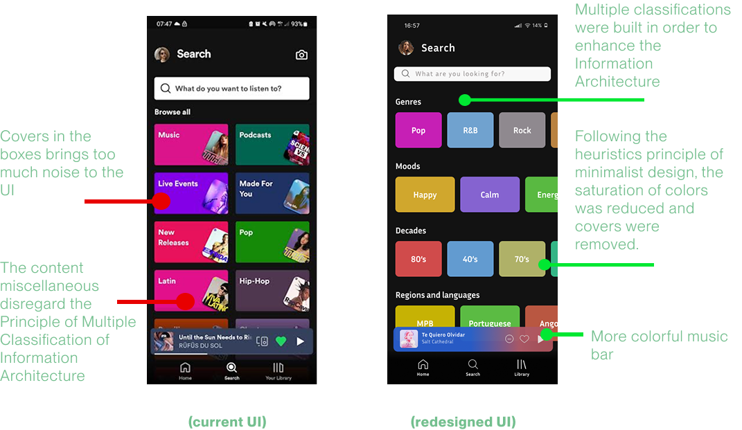
Cluttered with an overwhelming array of content, making navigation difficult.
Problem: To align with the business goal of personalized recommendations, the platform should suggest tailored content based on user data and adopt a more minimalist design to enhance user experience and better comply with heuristic parameters.
Define
Market Analysis
To think about the improvements that could be done in the app, it was compared the UI of Spotify with the interface of two main competitors in the field.
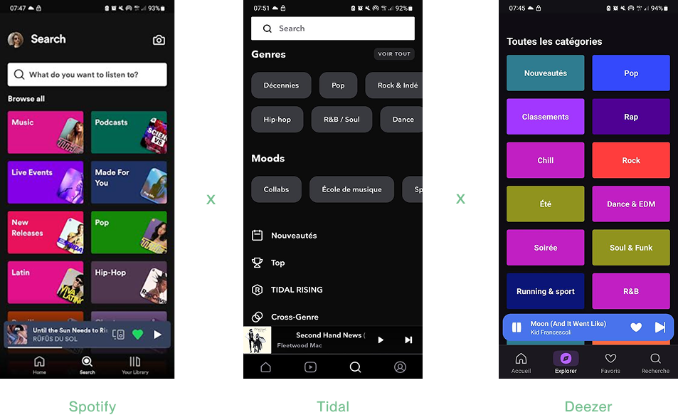
1 - Both competitor apps had a more minimalistic interface, that could be illustrated specially through the "Search Page";
2 - That the progression bar in the music box at the bottom was portrayed in a more colorful and clear way in one of the competitors interface, detail that I incorporated in my redesign.
Define
Design System

Prototype
Wireframing
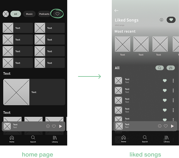
(current flow to access "liked songs" page)
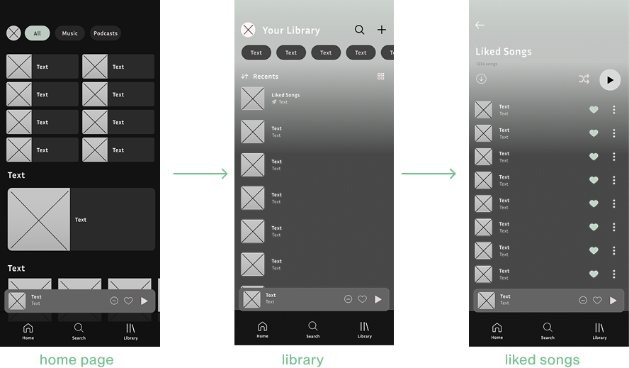
(redesigned flow with new feature, a button to shorten access to the "liked songs" page)
Prototype
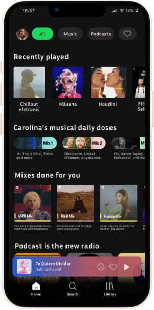
Redesigned Hi-fi Prototype
Home page
"Search" page
Testing
Usability Test
After testing it with five potential users, all of them approved inputing a title for that section, that was not labeled before.
All of them also approved the liked songs shortcut on main page.
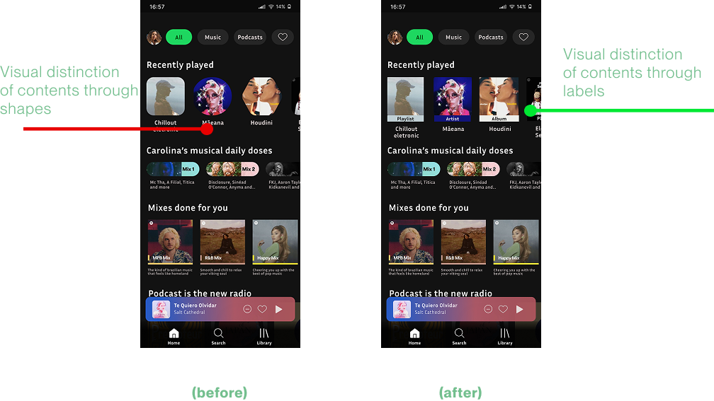
On the other hand, some of them said that the shape's redesign for the "Recently Played" section (also present in the redesign of the "Library" page) wasn't clear, what I iterated and changes after that feedback.
Opinions were split over the colorful progress bar.
Majority of users appreciated the removal of the covers in the "Search" page.
Minority of users though that the multiple classification in the "Search" page was necessary.
Iteration
Re-design from the redesign
Regarding Agile Methodology, I first iterated the most negative feedback from my redesign:
Considerations
- Visual style followed was the Design & Branding Guidelines from Spotify;
- Popular guidelines followed were: "8 principles of Information Architecture", by Dan Brown; and "10 Usability Heuristics for User Interface Design", by Jakob Nielsen;
- Design done to mobile apps (large android and iPhone 13 interfaces)
Next Steps
After the outcome of the Usability Test, next steps are:
- On one hand, iterating other aspects of the redesign;
- On the other hand, deploying some changes displayed in the redesigned UI, namely the favorite songs component and the title in the "Recent Played" section.
