H.appy
UX and UI development of a Wellness App
Client
Personal Project
Product's description
H.appy is a wellness-focused social media app that promotes mental well-being through laughter, offering coping strategies and educational content on its physiological benefits.
Timeline
- Overall: 6 weeks
- Research: 2 weeks
- Design: 4 weeks
Tools
- Figma
- Chat GPT
- Google Forms
Project Goals
Regarding the rising anxiety and depression linked to social media use, and inspired by my friends noting my "loose smile," I created an UX/UI concept that promotes mental well-being through laughter.
I did it based on the HCD (Human-Centered Design) principle.
Anxious users need to laugh, because it supports their mental well-being and helps ease anxiety.
Execute the work of a generalist designer, being the only one responsible for the UX Research and UI design of functional flows of a wellness app.
Why?
Because a significant increase was seen in the percentage of adults with anxiety symptoms (from 15.6% to 18.2%, respectively) and depression symptoms (from 18.5% to 21.4%, respectively) between 2019 and 2022.
Methodology
Design Thinking Process
Empathize
Quantitative Research
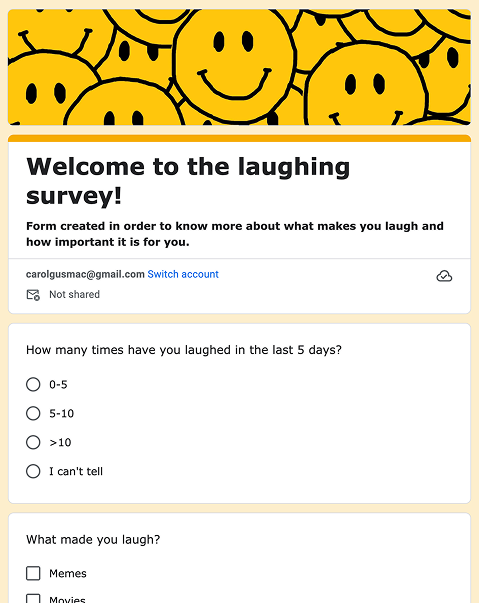
In the first part of the research, I conducted a survey before doing the user interviews and better understanding the user's needs.
The survey: I've prepared the survey with 11 questions and gathered over 40 answers.
Have you ever consumed content in order to induce laughter?
41 answers
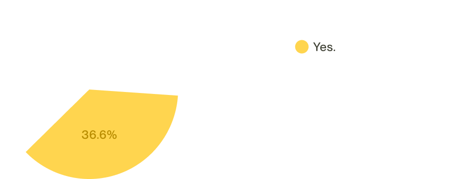
Have you presented any of the following mental/behavioral issues in the last month?
41 answers

Empathize
Qualitative Research
After understanding that over 35% of the users were consuming for contents to induce laughter, because they were experiencing episodes of anxiety or depression, I wrote and conducted an interview script. In 4 days, I recruited and interviewed 5 users and a Subject Matter Specialist (SME) remotely.
The survey: It was structured with 10 open-ended questions, focusing on our target audiences' potential laughter situations, how the laughter affected them physiologically, and about how aware they were about their mental health.
Define
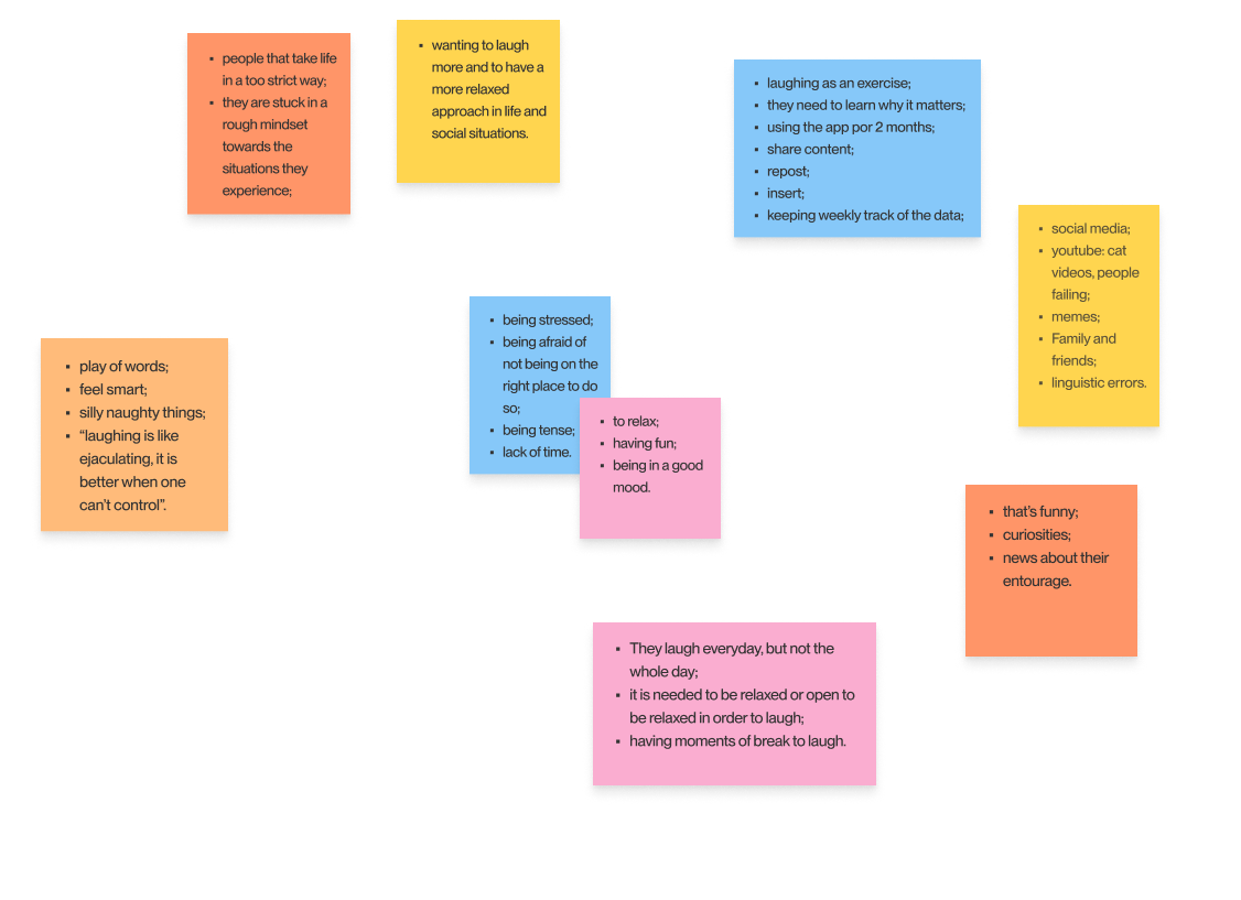
Empathy Map
From the research data, I've understood some key points to build an empathy map. It is a method used to synthesize rational and sentimental aspects of the users through their situation, acts, feelings and emotions.
The goal is to reach an empathy level where the designer can look at the world through the user's eyes.
Ideation
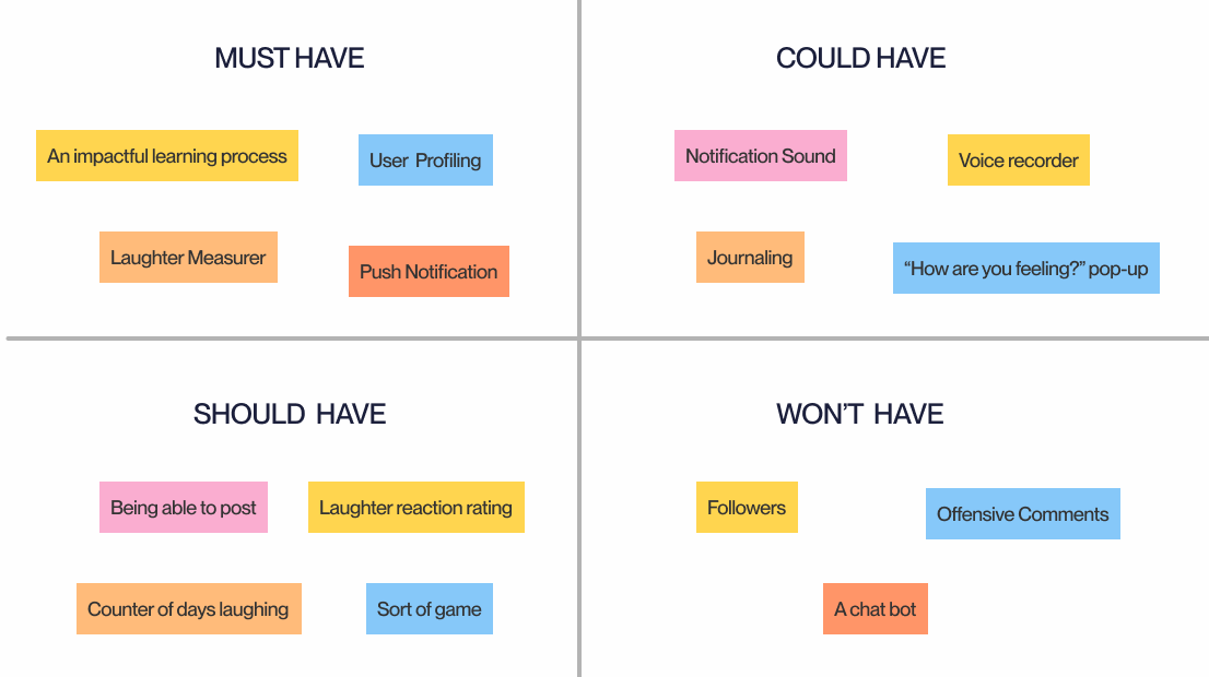
Features Prioritization
Regarding the highlights from the User research and Empathy Map, I've stablished some features that would be either an asset or a problem in Usability.
Prototype
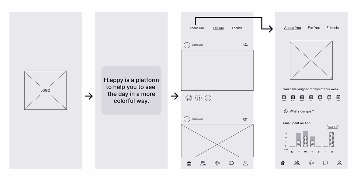
Lo-Fi wireframe
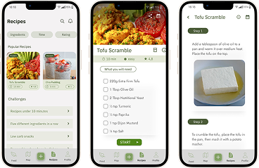
The first prototype I've done sketched the flow from the app presentation to the data page, including a description page.
Prototype
Design System
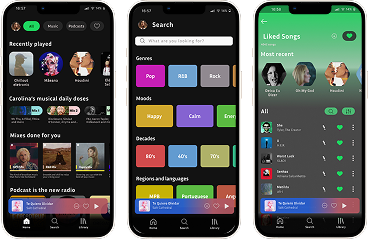
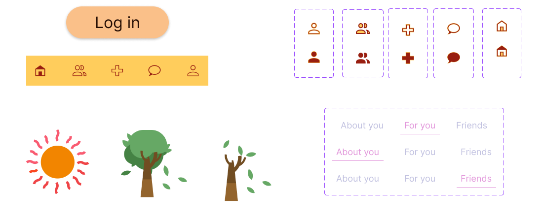
I created a Design System regarding what I found out from the market research.

Prototype
Hi-Fi Prototype
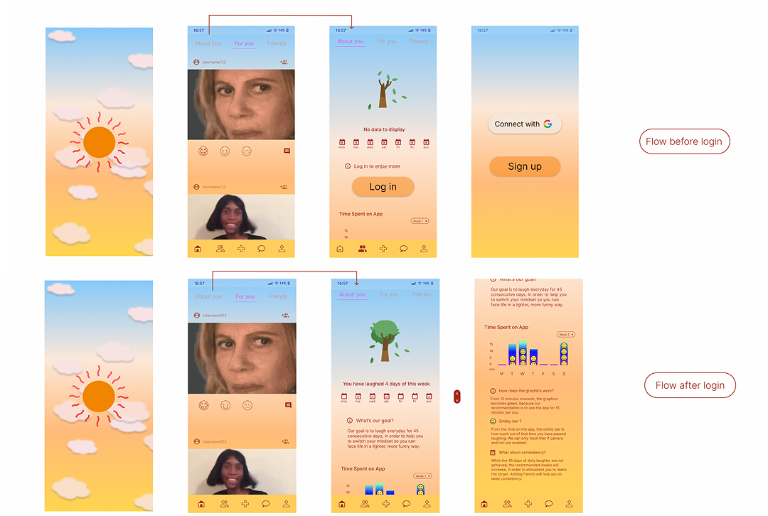
After applying the design system on the lo-fi wireframes, I created a fully-functional, high-fidelity prototype of three flows using Figma.
Prototype
GDPR Compliance
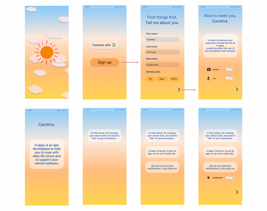
One of the challenges that I faced was developing a flow to inform the users that by collecting their data, the use of the app would be enhanced by measuring laugh trough the mic, for example.
This is important as I wanted to develop an app that was compliant with GDPR (General Data Protection Regulation).
So I added a toggle, so the user could select if it would rather authorize or not that usability.
Test
Usability Testing
I've tested with 5 potential users.
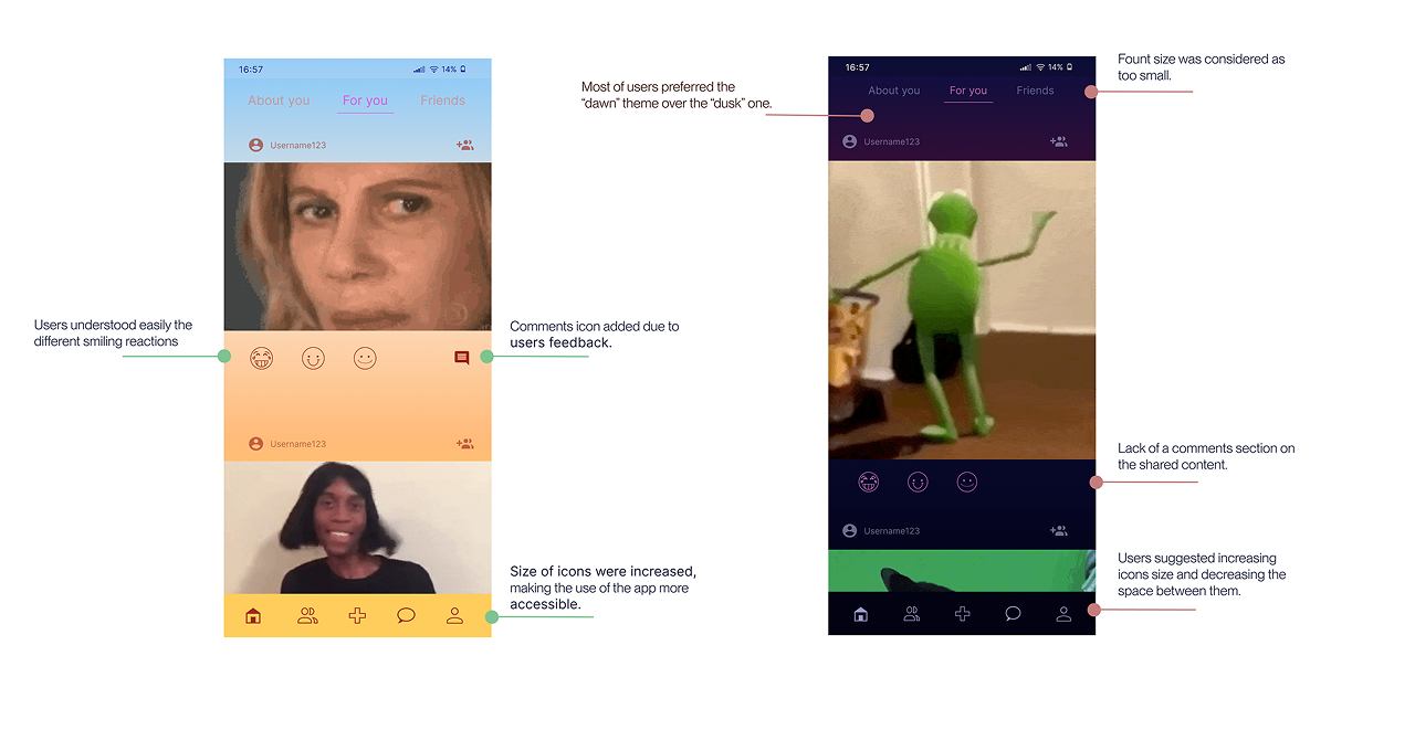
Some of the obtained feedbacks were: small icons and letters, lack of a comments button, the suggestion of replacing a manual registration to a login using google button, and the idea of tracking laughing through additional gadgets, as, for example, smartwatches or earbuds. All the users said that they would definitely give a go for the app, and that they would rather use the light UI; than the darker one.
Prototype
Web Page
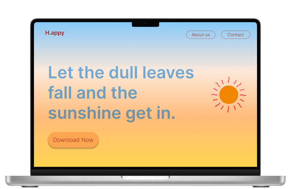
Once the usability issues were resolved, I moved on to design other flows' screens in Figma. My goal was to create a visual identity that's aligned with the brand's values of connecting people through the joy of laughter: playful, organic, simple and optimistic. I've designed an app and a promotional web page.
Iteration
Next steps
The next step for the app will be developing the flow of the other bottom bar icons; thinking how to monetize it (if by applying a monthly subscription model or by adding some publicity + and the possibility of removing it by paying for the app itself).

Project
Learnings
My main learning was definitely how to conduct the whole path to get on a final UI result and their relevance within the Design Thinking process.
There's a Research work behind the UI development, in order to have a consistent product's proposal, and it must be well explained, when developing and preparing the product's pitch.
It was a pleasure to see an idea raising like that, and I'm excited to work further on projects which can actually enhance user's wellbeing.
